Curinos Brand Refresh
Project Overview
Curinos was formed when Novantas (my prior company) and Informa’s FBX company merged and spun off into a new entity in 2021. It was a rather fast turnaround for all elements and an outside company was hired to name and create the brand guidelines for the new company.
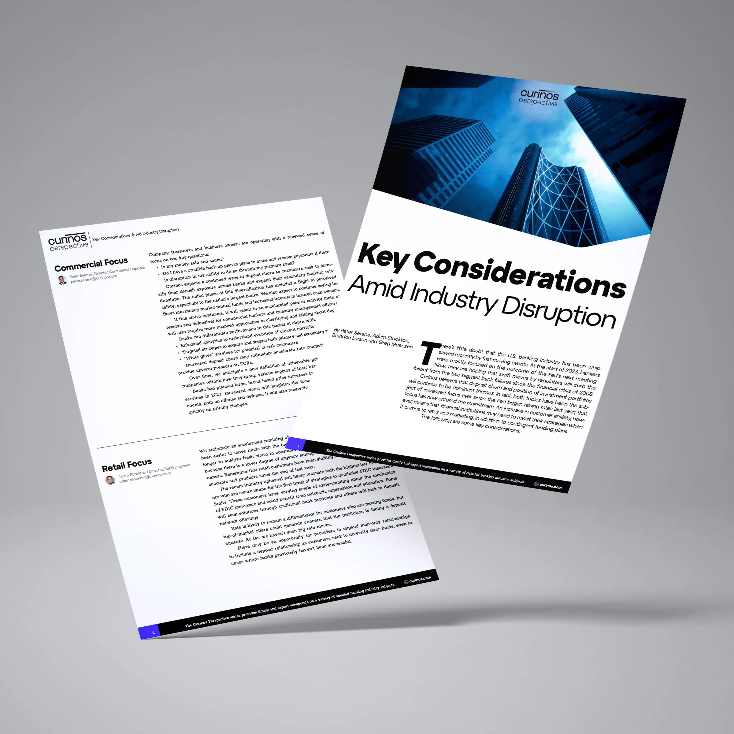
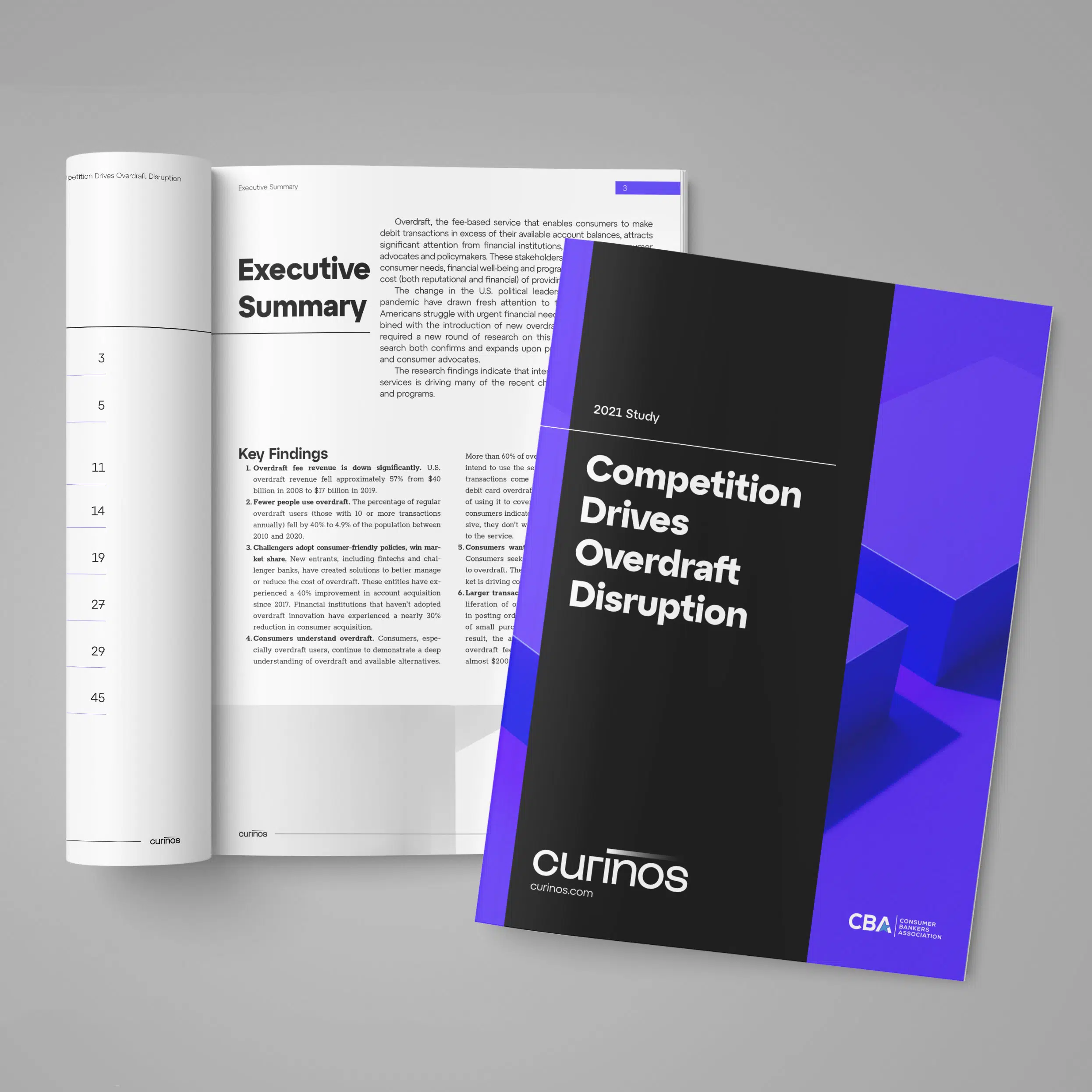
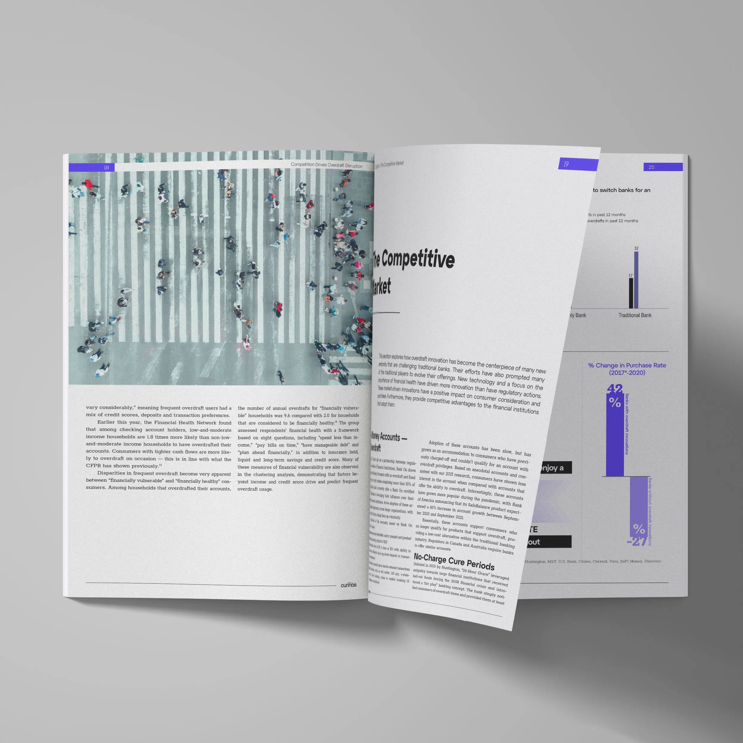
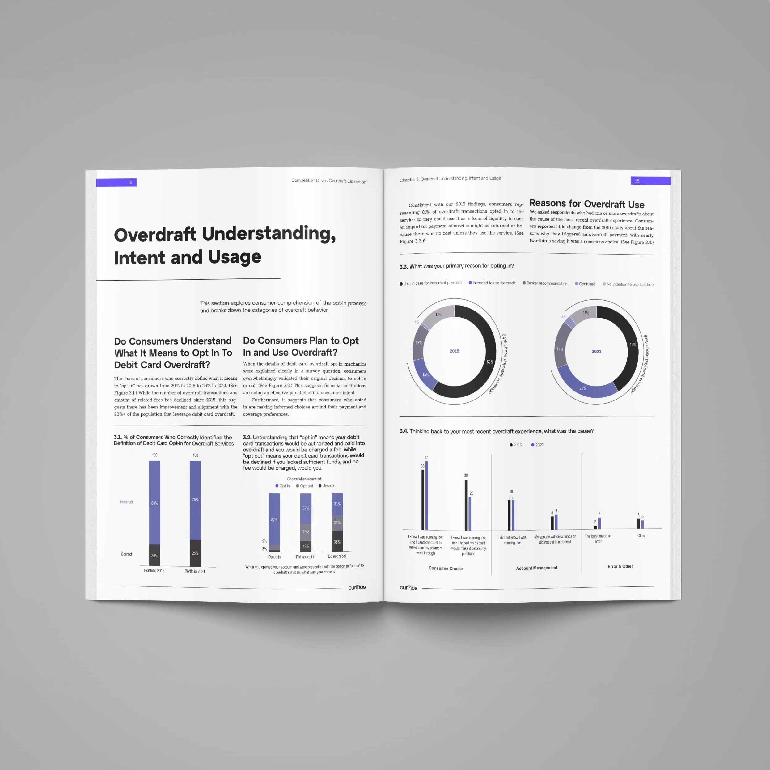
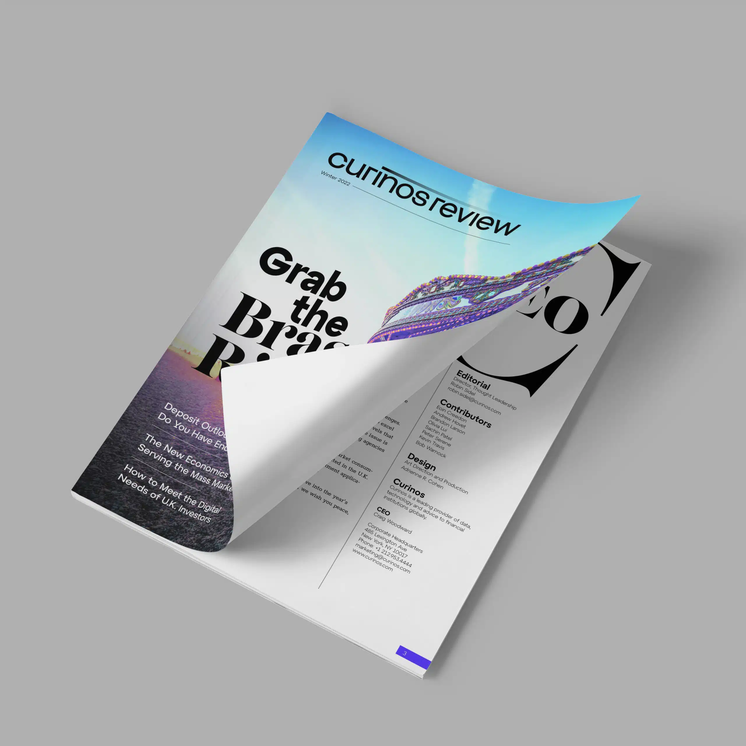
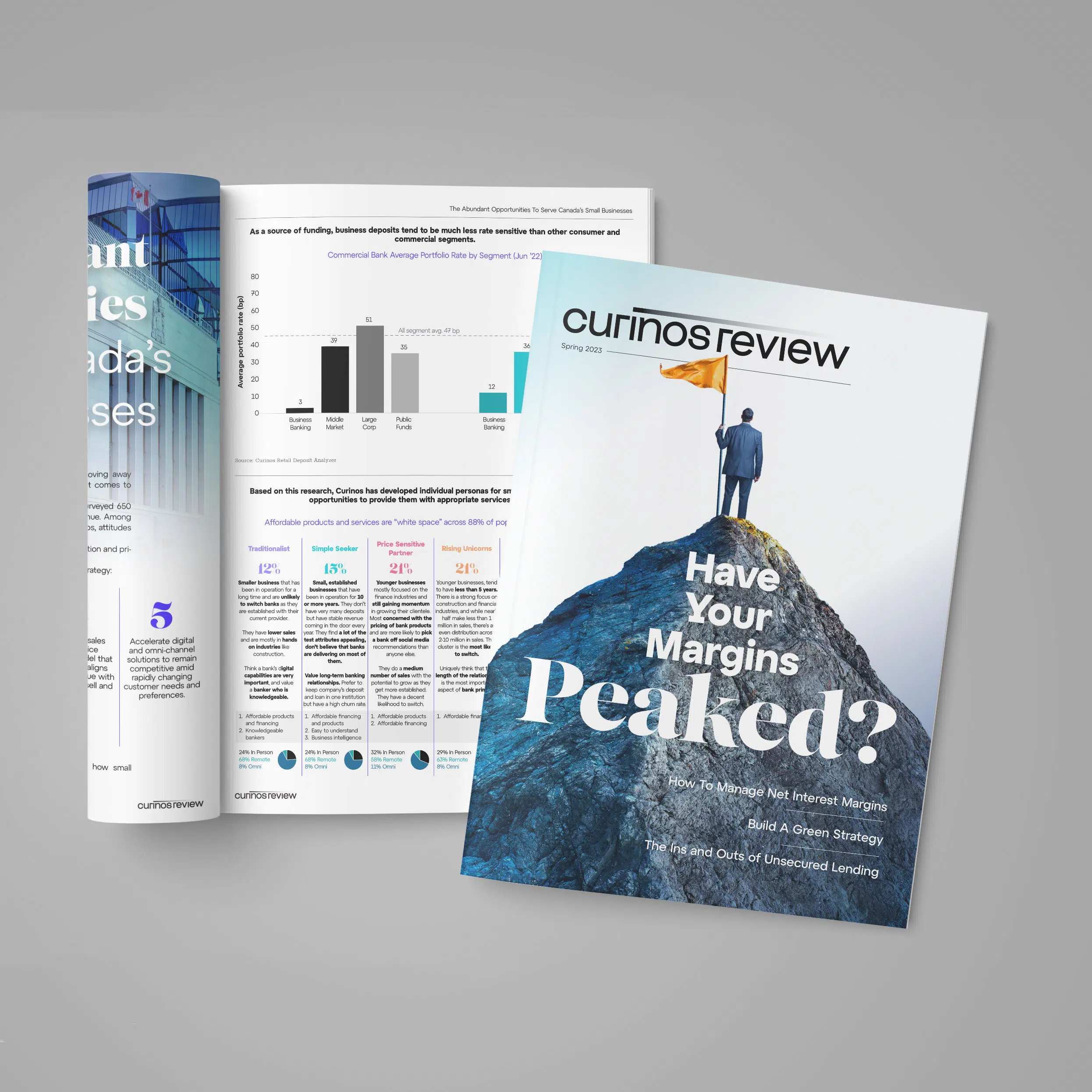
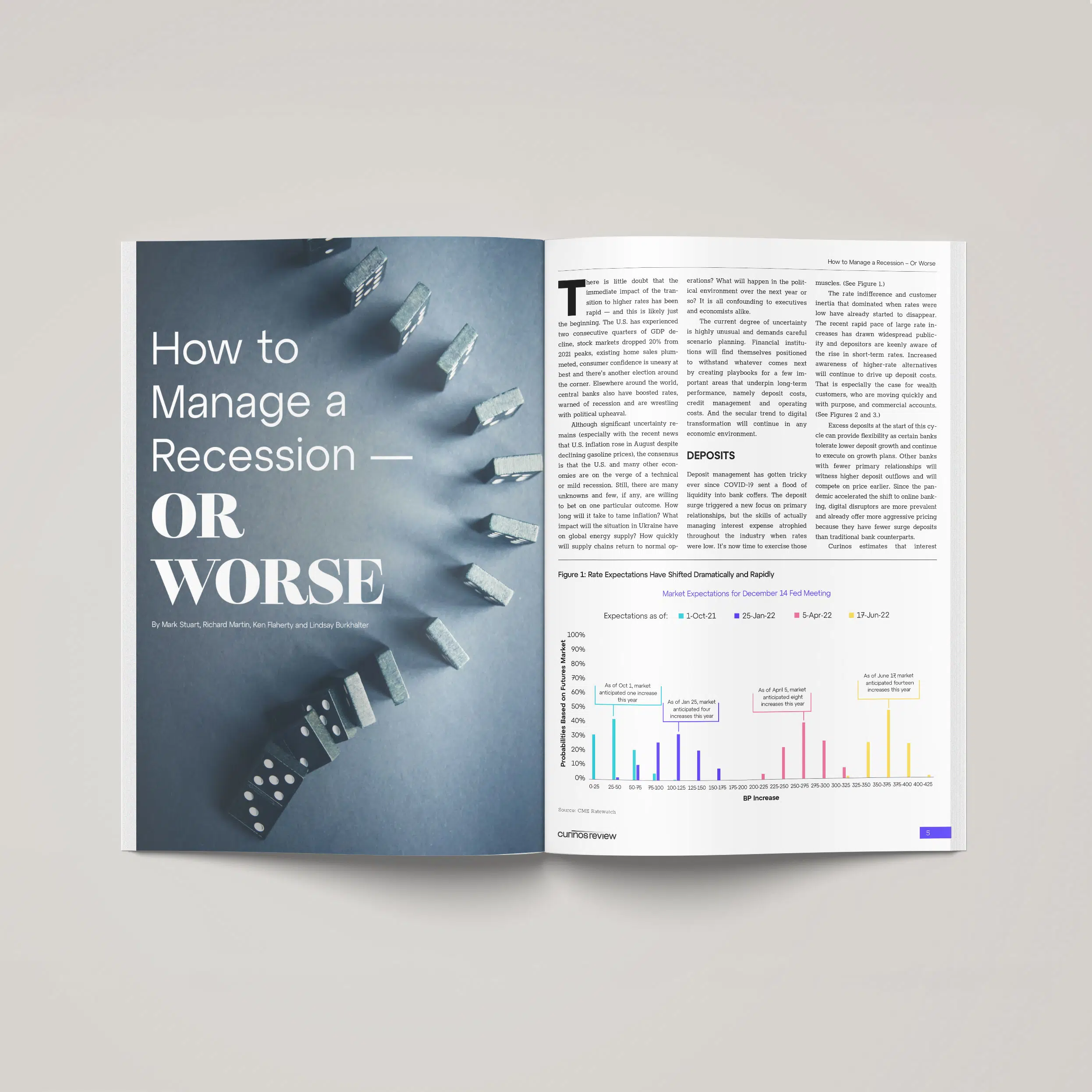
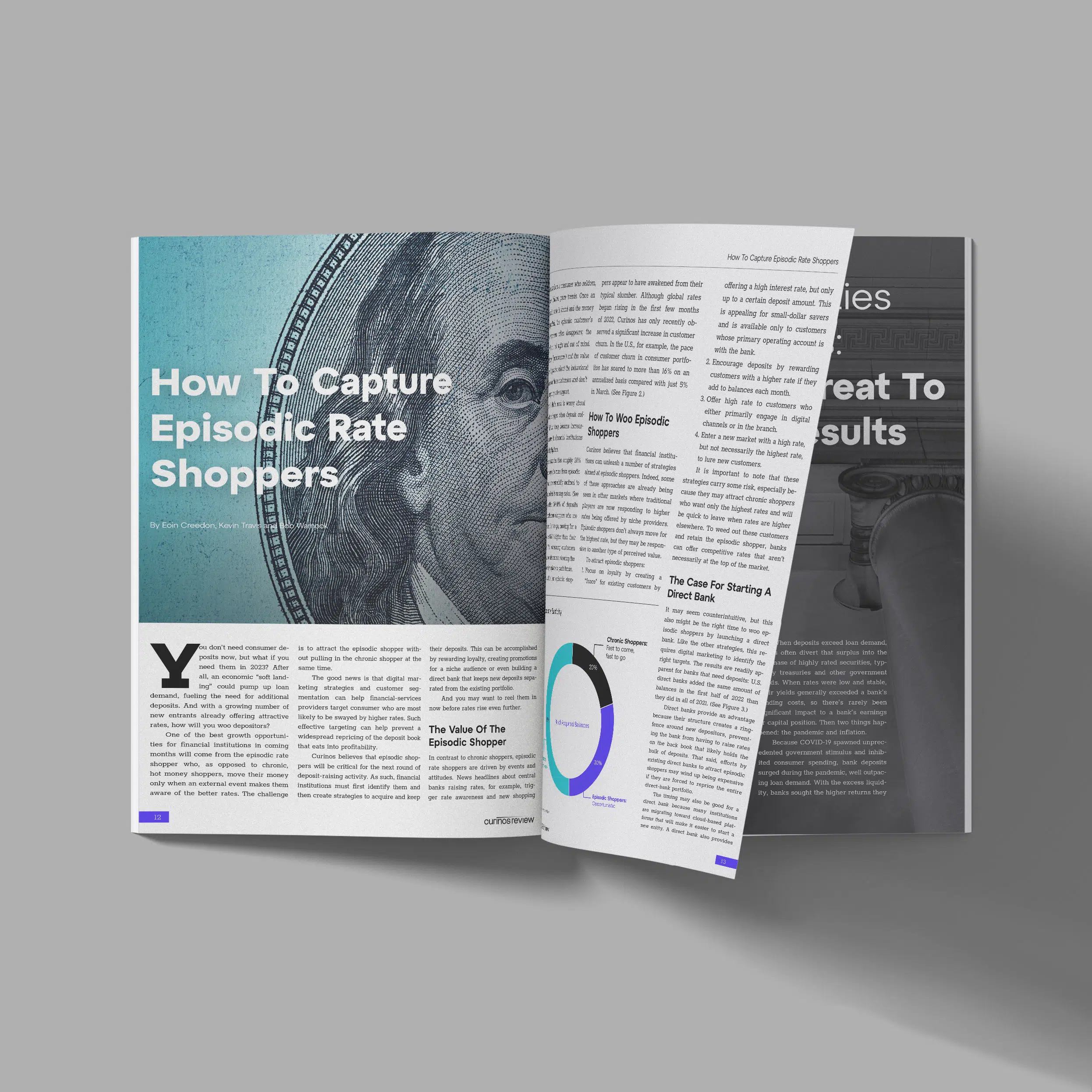
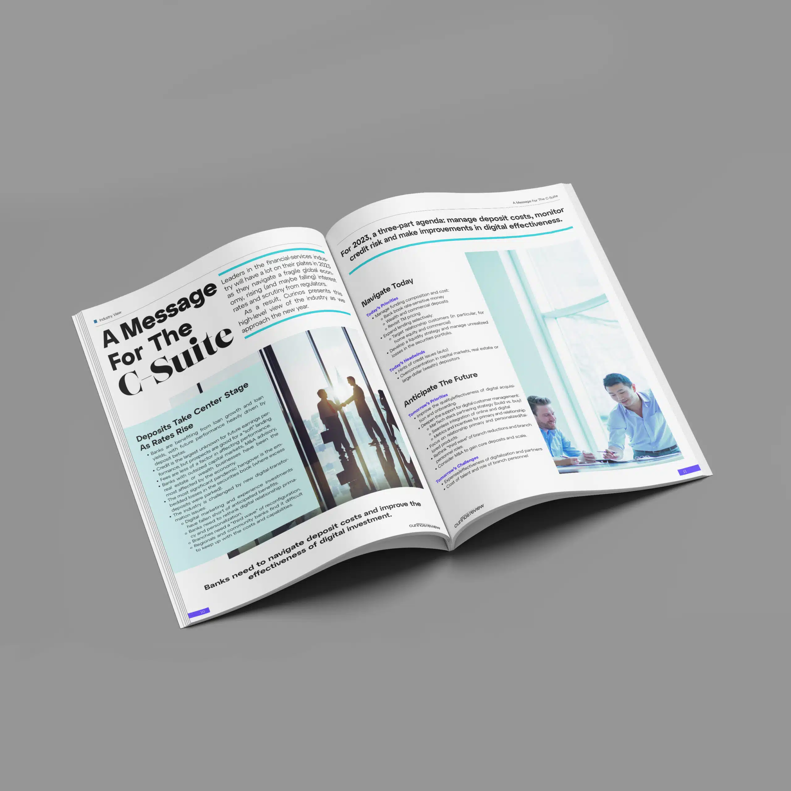
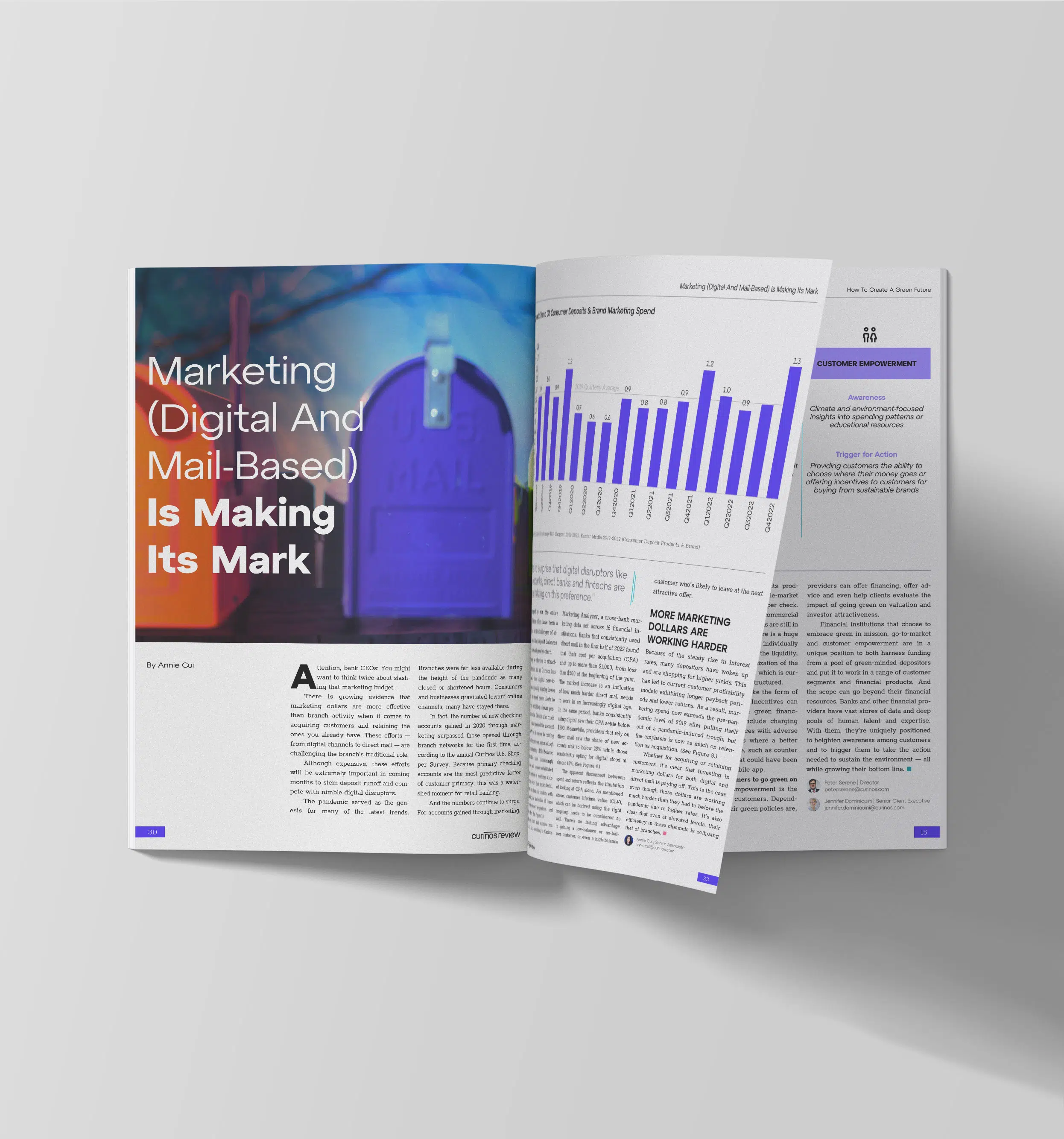
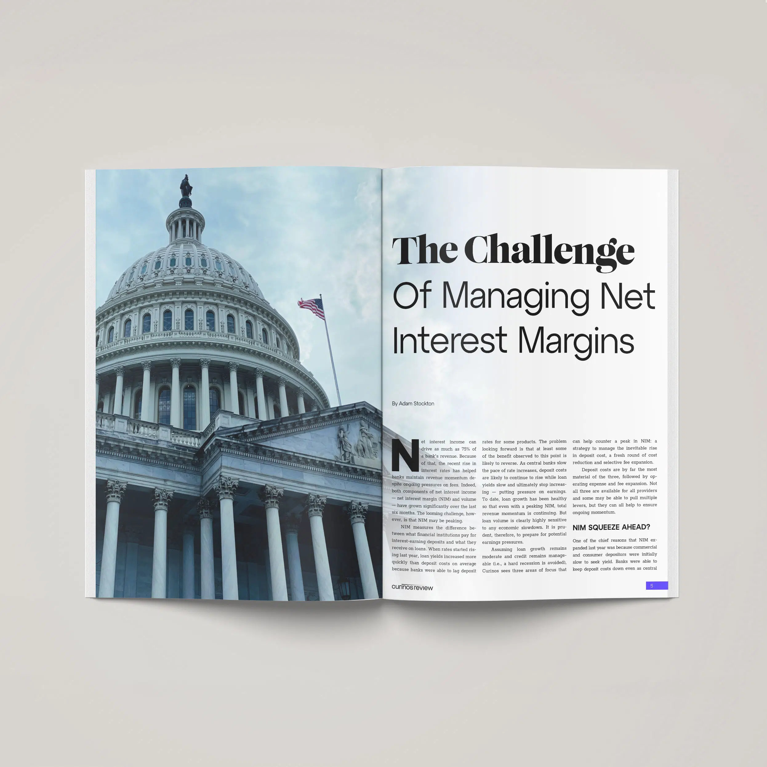
The original branding did not address all the company’s needs so I filled in the blanks, diving into all things newly Curinos. This included revising the color palette, extending the photography guidelines, building and creating all print collateral, establishing a coherent look with all the pieces provided by the branding company, etc.
In late 2022, I refreshed the brand and all collateral to reflect how Curinos had grown and matured from its initial somewhat-rushed form.
Channels: Print, Web/Digital, UI/UX, Social Feeds, Podcast & Video
Role: Art Director, Brand/Senior Designer, Video & Podcast Producer/Editor
Tools: Figma, Illustrator, InDesign, After Effects, Photoshop, WordPress, Canva, Hubspot
Elements
Starting Point
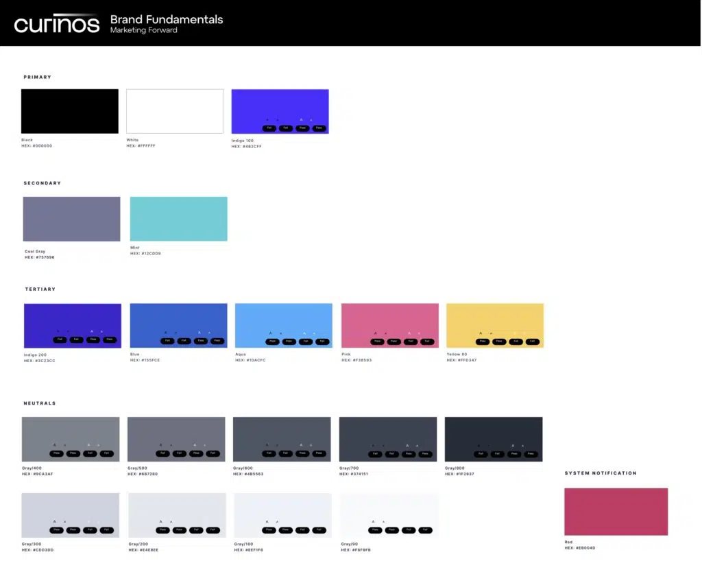
The original branding company provided black, white, and six additional colors. Curinos creates products that use data visualization for clients so we needed an extended palette for the product team and required a palette that was WCAG compliant.


Next Steps
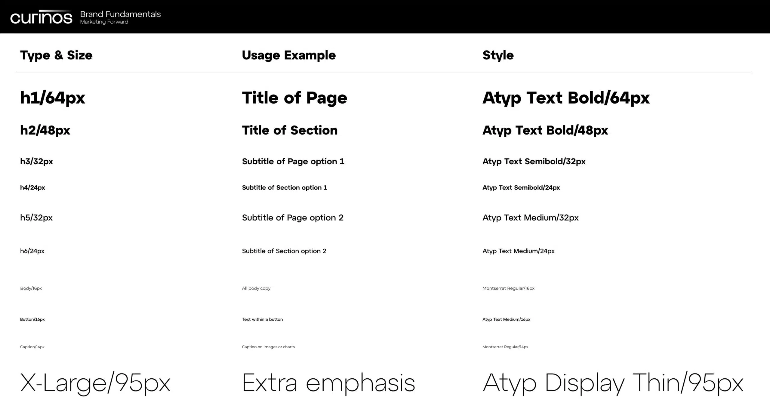
The product team needed more UI/UX-friendly colors so we worked together to make the palette WCAG compliant, extended it for data visualization needs, and revised the font set the original company picked to be more legible on devices.
The first five colors – black, white, indigo, teal, and lavender grey – are the main colors used in all marketing materials. Per the original brand guidelines, Curinos’ main colors are black and white.
UI/UX Guide
Button Styling for Web & Product // Interactive
Card Styles for Web & Product // Interactive
Featured Insight
Category
Blog placeholder
- Post Excerpt
Insight // In the Press
Category
Blog placeholder
- Source
Solution
Solution Name
Solution description text Lorem ipsum dolor sit amet, consectetur adipiscing elit. Duis ligula urna, facilisis quis tellus in, rhoncus sollicitudin magna. Integer dui felis, feugiat sed ligula sit amet, vulputate lobortis nisl.
Website 2.0 // Wireframes

The marketing team started with a microsite at the company’s official launch, expanding it as the year progressed. In November 2022, the official website was launched. After an initial pass in collaboration with the product team and our contract web developer, I designed our remaining page layouts (done in Figma and directly in WordPress using Elementor). Our Digital Content and Marketing Manager and I worked together to create page and section templates in WordPress for her use as the site continues to grow.
Below are the Figma wireframes as compared to the live site views (hover to see live).
Social Tiles
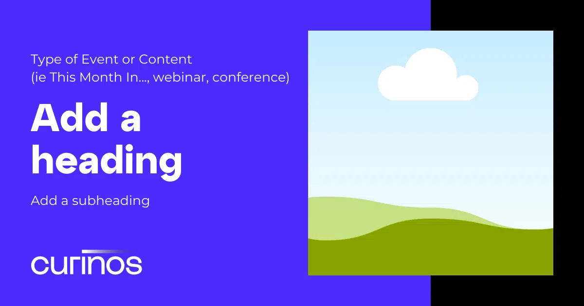
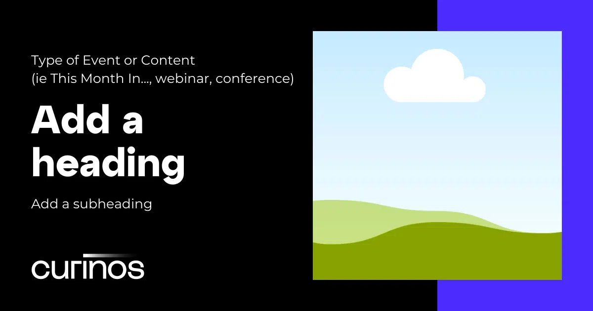
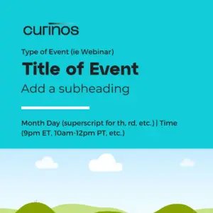
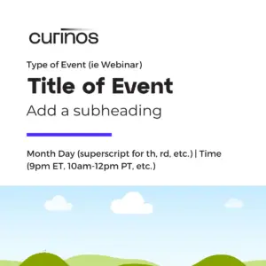
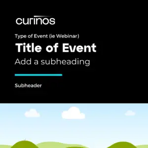
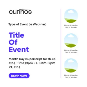
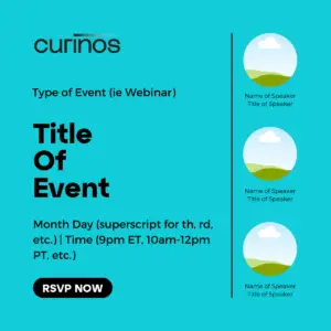
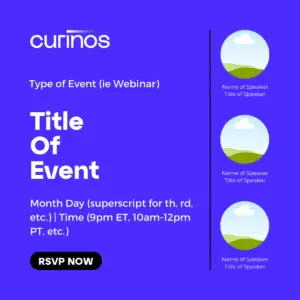
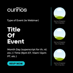
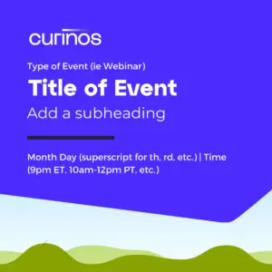
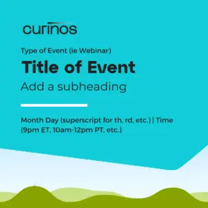
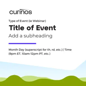
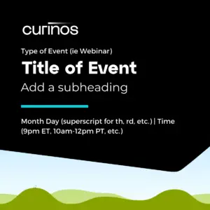
In order to meet the needs for social tiles that accompany any posts on LinkedIn or Twitter, I created templates on Canva for my colleagues to use on a self-serve basis.
This way we ensured consistency while enabling each marketing communications manager to get their particular event or thought leadership piece advertised in a timely manner. Each tile’s style is defined as to create a visual association with a specific type of content.
Some tiles include animation, which I put together for the marketing communication manager.
Rectangle & Square Canva-based Templates


Branding Contractor's PPT Shell
PowerPoint
The original branding contractor provided a basic powerpoint shell that, unfortunately, did not fit the company’s needs. As a fintech, presentations are often data-heavy and we needed more specific layout options for charts and text. I revised the powerpoint twice – the initial pass based more firmly on the original and the latest iteration that launched with the brand refresh, which is much more quintessentially Curinos.
